Creating a system of safety – the Vision Zero SF Ten-Year Report (opens in a new window) .
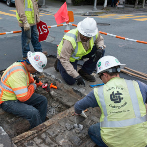
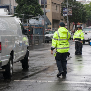
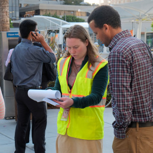
As we live, work and play in the City by the Bay,
we want to feel safe as we move around.
Creating a system of safety – the Vision Zero SF Ten-Year Report (opens in a new window) .